- The Swipe
- Posts
- DIY Whoppers, Coffee Wakes, & Golden Silence
DIY Whoppers, Coffee Wakes, & Golden Silence
From Burger King’s home-cooked hacks to Apple’s quiet genius, these ads prove simplicity sells best.
The Swipe
October 21, 2025

Welcome back to your daily marketing swipe file. The best ads, served fresh daily, and as tasty as your favorite slice of pepperoni pizza. 🍕 Let’s dig in.

Expert marketers, ready to deliver fast results.

Marketing shouldn’t be a guessing game. Marketing Wizzards connects you with top-tier marketing professionals, from SEO experts to content creators, who know how to boost engagement and grow your brand.
Whether you need a paid media strategist, email marketer, or social media expert, we match you with pre-vetted talent, ready to deliver results. Hire smarter, scale faster, and grow your brand today.
Each professional seamlessly integrates into your workflow to produce measurable success.
*This is sponsored content. See our partnership options here.

‘Quarantine Whopper: Assembly Required’ — Burger King
What’s happening: Burger King reveals the ingredients needed for a Whopper, encouraging customers to DIY the iconic burger at home using common supermarket items during the global lockdown.
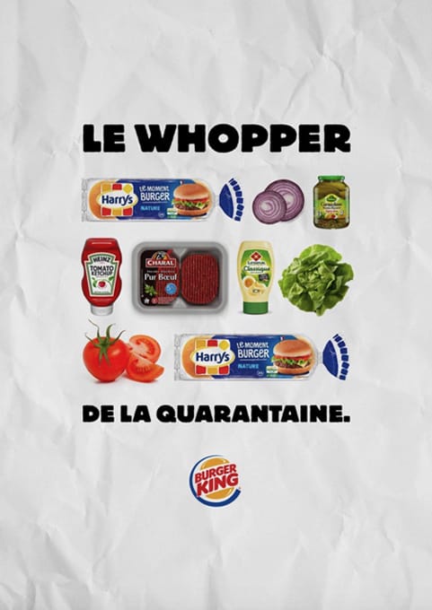
Why it’s awesome: This ad brilliantly turns a disadvantage (closed restaurants) into a cheeky challenge. By literally giving us the ingredients, BK empowers home cooks, keeping the Whopper brand alive and totally cravings-worthy during lockdown.
‘Disconnect to Reconnect’ — Timex
What’s happening: A minimalist billboard features a single Timex analog watch centered on a plain white background. Below it, the copy reads: “Know the time without seeing you have 1,249 unanswered emails.” The ad carries only two small brand identifiers — “Adsum” and “Timex” — placed discreetly in the corners.
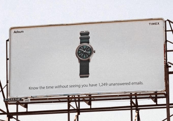
Why it’s awesome: This campaign uses simplicity to deliver a powerful cultural commentary. In a world obsessed with smart devices and constant notifications, Timex repositions the analog watch as an escape from digital overload. The copy is both witty and relatable — a subtle jab at our collective screen addiction. The minimal layout mirrors the message itself: clean, uncluttered, and refreshing. It makes the analog watch feel like a luxury of calm in an anxious digital age.

Seen by the people who make things trend.
The Swipe is where 112,000+ marketers, founders, and creatives come for their daily dose of bold ideas.
If your brand helps people create better content, run smarter campaigns, or grow faster—this is your audience.
Show up next to the most compelling creative in the game, and be discovered by the people who set trends, not follow them.
*This is sponsored content

‘The Comma That Saves Gandma’ — Grammarly
What’s happening: The ad shows the sentence “LET’S EAT GRANDMA.” in bold, black text with pink highlighting and a cursor — evoking a digital editing interface. Beneath it, a tagline reads: “One comma makes all the difference.” The Grammarly logo anchors the piece at the bottom, clean and minimal.
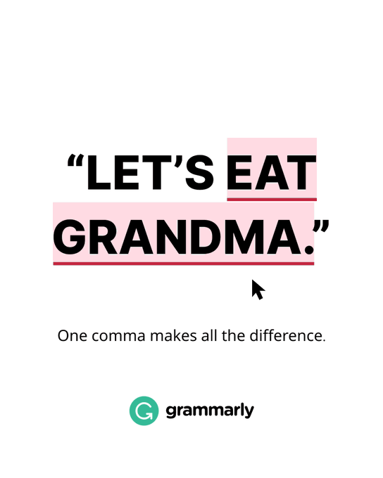
Why it’s awesome: This ad distills Grammarly’s value proposition into a single, humorous, and instantly understandable example. By playing on a common punctuation joke, it transforms grammar correction — usually a dull topic — into something clever and memorable. The visual simplicity keeps focus on the message, while the humor drives instant recognition and shareability. It’s education disguised as entertainment — a classic example of “show, don’t tell.”
‘The Letter That Woke Up’ — Nescafe
What’s happening: The ad features a black background filled with uniform white “Z” letters — a universal symbol for sleep. Toward the bottom, a few of the Zs begin to transform into “N”s, leading to the NESCAFÉ logo and the tagline: “Nothing wakes you up as Nescafé.”
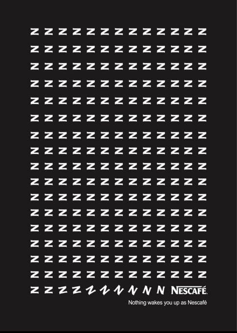
Why it’s awesome: This is minimalism at its finest. With no image of coffee, cup, or steam, Nescafé communicates its message purely through typography and symbolism. The shift from “Z” to “N” visually represents the moment of awakening — simple, clever, and immediate. It’s the kind of ad that rewards viewers for paying attention, creating that little “aha” moment that sticks. The dark background and repetitive pattern reinforce the idea of sleep, while the emerging “N” mirrors the feeling of caffeine kicking in.

Roko’s Basilisk skips the buzz words and cuts straight to what moves markets, products, and careers. Read it over coffee and sound brilliant on your next call.
*This is sponsored content

‘Silence, With Style’ — AirPods Max
What’s happening: The ad shows a clean white background with a pair of silver AirPods Max centered below the headline: “Silence is golden.” Beneath it, a witty follow-up reads: “Also available in silver.” The Apple logo and product name appear at the bottom in minimalist black type — signature Apple aesthetic.

Why it’s awesome: This ad is a masterclass in Apple’s understated wit and design-led communication. The headline plays on the familiar proverb “Silence is golden,” cleverly linking noise-cancelling performance with color options. It’s a single line of copy that merges function, form, and brand personality — quiet sophistication with a wink. The minimalism of the layout mirrors the product promise: simplicity, clarity, and calm.


That’s a wrap! We hope these bold, fun, and inspiring ads gave you your daily dose of creative energy. See you soon for some more best-in-class marketing goodies!
How was today's swipe file? |